Your Website Isn't Your Front Door Anymore

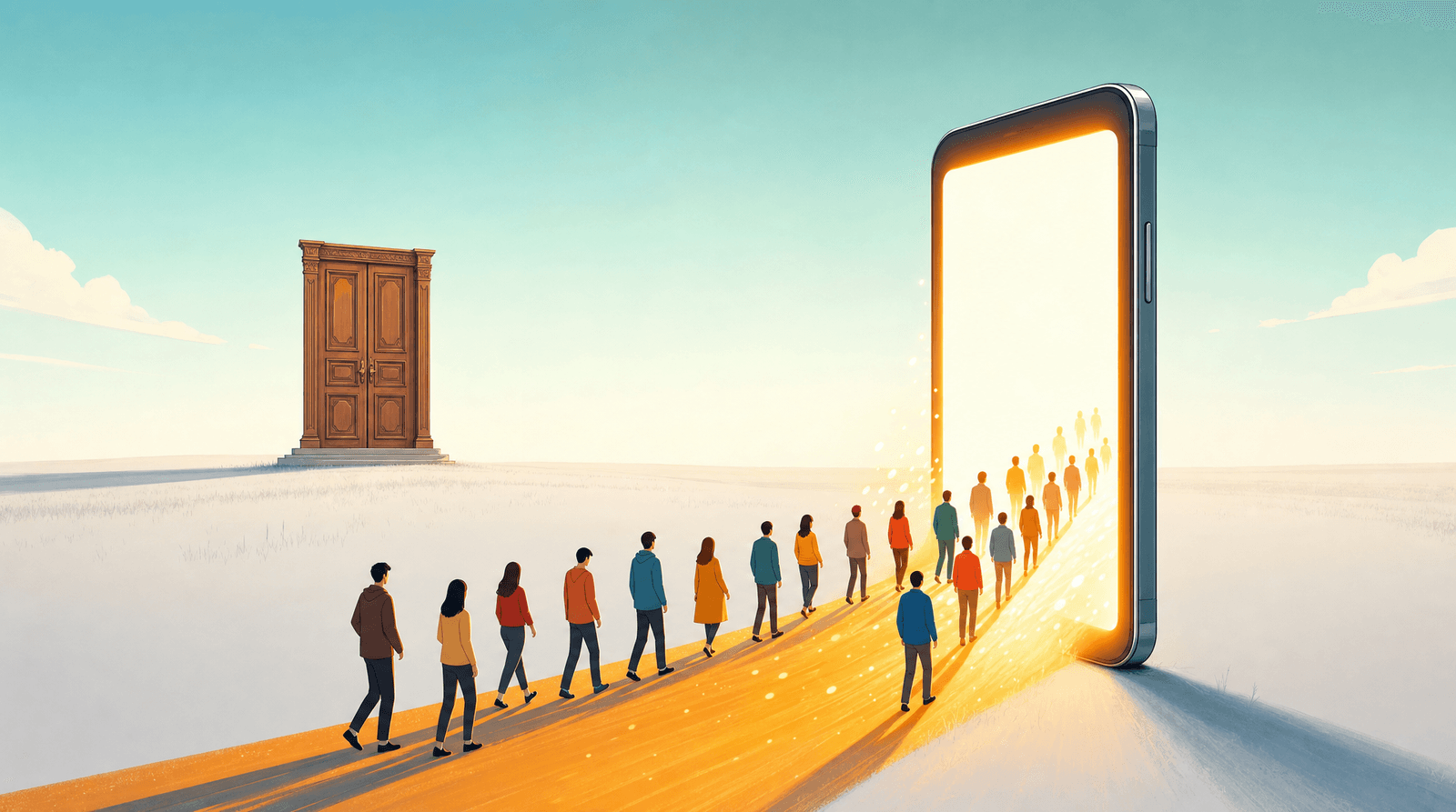
Think about the last five people who bought something from you, booked you, subscribed to you, or emailed you asking if you were taking clients. Now trace backwards. Where were they standing when they decided?
Almost none of them were on your homepage. They were on a phone. They were in an Instagram profile, or a TikTok comment section, or a Google Maps listing someone had screenshotted into a group chat. They read a name, looked at a few images, formed an opinion in about four seconds, and then either tapped one link or left. Your website, if they ever saw it, came later. Sometimes much later. Sometimes never.
This is not a small shift in traffic patterns. It is a change in the architecture of your business. The place where strangers meet you for the first time is no longer a page you designed. It's a page a platform designed, with your stuff arranged inside it. And the one piece of that page you fully control, the link, is usually the piece that got the least thought.
The front door moved and nobody sent a memo
For roughly fifteen years, the advice was consistent and correct: get a website. Own your presence. Don't build on rented land. Every marketing dollar funneled toward a domain you controlled, and the website became the front door, the thing you sent people to, the thing you redesigned when the business changed.
That advice hasn't stopped being true. It has stopped being first.
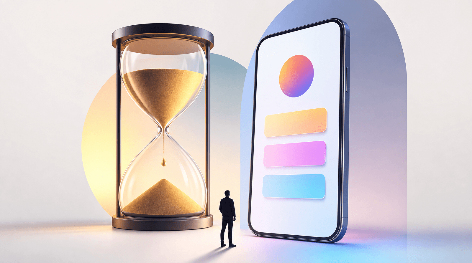
Watch how discovery actually works now. Someone sees a Reel. They tap the profile picture. They scan the grid. They read the bio. If they're still interested, they tap the link. That entire sequence happens inside one app, on one thumb, in under thirty seconds, and the website only enters at the very end, if at all. The homepage that used to greet people now sits one layer deeper, behind a tap that most people never make.
The same is true offline. A customer walks past your shop, doesn't come in, and looks you up on their phone standing on the sidewalk. They land on a Maps listing or an Instagram profile. Not your homepage. Not the one with the hero video you paid for.
None of this means the website was a mistake. It means the greeting job got reassigned, and most businesses never updated the org chart. You still have a front door. It just isn't where you built it, and it's currently being staffed by a bio line you wrote in 2023 and a link you've never once looked at on a phone.
What people actually need in the first ten seconds
Here's the uncomfortable part. The front door's job is not to impress anyone. It's to answer three questions fast enough that a stranger doesn't leave.
What is this? Not your tagline. Not your mission. The literal category. Bakery, tattoo artist, wedding photographer, bookkeeper for creative businesses, podcast about small-town history. People cannot decide to want something they cannot classify, and "helping people live their brightest lives" classifies as nothing.
Is this for someone like me? Location, price range, availability, vibe. A stranger is trying to eliminate you, because eliminating is faster than considering. Give them the facts that let them stay. If you're a photographer who only shoots in Portland, say Portland. If your sessions start at $600, say $600. We've written before about why nobody is going to DM you for prices, and the short version is that making people ask is a tax most of them won't pay.
What do I do next? One obvious action, sized for a thumb. Book, buy, subscribe, listen, get directions. Not eleven equally weighted options in a stack.
That's it. That's the whole job. And notice how badly a traditional homepage performs against it: a full-width hero image, a nav bar, an about section, a scroll-triggered animation, and the actual answer to "what is this and can I book you" somewhere below the fold on a screen that is 390 pixels wide.
The front-door test is simple and slightly brutal. Open your link-in-bio page on your own phone. Do not scroll. Count how many of the three questions get answered in what you can see. Most people, honestly, get one and a half.
The website didn't die, it got promoted
The instinct at this point is to conclude that websites are over, cancel the redesign, and pour everything into social. That's the wrong lesson, and it's expensive in a different way.
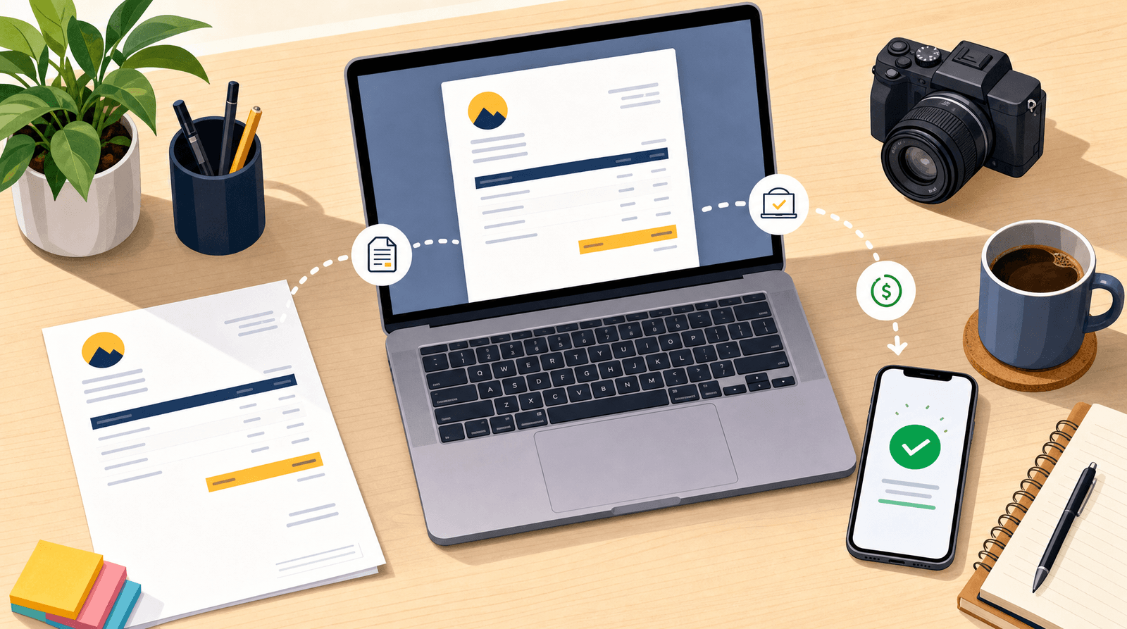
The website is still where the substance lives: the full portfolio, the long case studies, the shop with a hundred SKUs, the booking system, the terms, the blog that quietly ranks for things people search at 2am. That material is genuinely valuable. It just isn't a greeting. Nobody has ever been converted by a site map.
So think of it as a promotion. Your website used to be the greeter and the closer, doing both jobs badly because they need opposite things. Now the greeter role belongs to your profile and your link-in-bio page, which is fast, mobile, and ruthless about the three questions. The website becomes the back room: deeper, slower, and there for the people who have already decided they're interested.
Once you see it that way, a lot of arguments dissolve. You don't need your bio link to contain your entire website. You need it to contain the door to it. You don't need your homepage to load in half a second for a bored scroller, because the bored scroller is never getting there, and the person who does get there has already opted in.
This is also why "just link to my homepage" underperforms so reliably. Sending someone from a profile to a homepage means asking them to re-orient in a completely different design language, on a layout built for a laptop, and then find the one thing they wanted. Every one of those steps is a place to lose them. A link-in-bio page sitting in between doesn't add a step. It removes the step where they get lost.
Staffing the door you actually have
If the greeting job has moved, the work moves with it. Practically, that means treating your bio link with the seriousness you'd give a storefront, which mostly comes down to four habits.
Write the first line for a stranger, not for yourself
The top of your page is prime real estate and it is usually spent on something the reader can already see: your name, which is right there in the profile they came from. Replace it with the thing they can't infer. "Custom cakes, Denver, order two weeks out." "Weekly newsletter about restaurant economics." It reads as less clever and performs far better. There's a related trap we've covered in stop designing your link-in-bio for strangers: the fix isn't writing for nobody, it's knowing which visitor each part of the page is for.
Let the page change as often as the business does
A storefront window in December doesn't look like it does in June. Your page should have the same rhythm. Whatever is most true this month goes at the top: the launch, the last three slots, the tour dates, the seasonal menu. Everything else drops down. This is a five-minute edit, and it's the single highest-leverage thing most people are not doing.
Make the next action unmistakable
One primary action, visually louder than everything around it. If your page has nine buttons that all look identical, you haven't given someone a choice, you've given them a decision to postpone. The math here is unforgiving and we've laid it out in how many links should you actually have on your link-in-bio page, but the instinct is easy: if you added a link this year and can't remember why, it's competing with the one that matters.
Look at what the door is telling you
A physical front door gives you no data. A digital one gives you plenty, and almost nobody reads it. Liinks tracks views and clicks per link, which means you can see the gap between what you think people want and what they tap. That gap is where the money is. If 80% of clicks go to one button, that button should be bigger and first. If a link has been up for six months with a dozen clicks, it isn't a link, it's decoration.
Groups and sections help here too. Rather than one flat list, cluster things the way a visitor would ask for them: "Work with me," "Shop," "Listen." A stranger navigating by category moves faster than a stranger reading a list, and moving faster is the entire game at the front door.
The quiet cost of getting this backwards
The reason this matters more than it sounds is that the mismatch compounds silently.
You never see the person who tapped your link, waited two seconds for a heavy homepage, and left. You never see the one who couldn't tell from your bio whether you serve their city. You never see the one who wanted to book, found four ways to contact you and no way to book, and picked the studio with the button. None of them show up in your analytics as a problem. They show up as slightly lower numbers, which you explain to yourself as reach, or the algorithm, or a slow month.
Meanwhile the redesign gets budget, because the website is visible to you. You look at it. Your friends look at it. It feels like the business. The profile, which is what strangers look at, feels like marketing admin.
Flip that. Spend an hour on the door before you spend three months on the room behind it. And be honest about how people find you now: increasingly it isn't even a search box, it's a recommendation from someone or something else, a shift we dug into in you're not being googled anymore, you're being asked about. Whatever surfaces you next, the landing spot is a small page on a phone. That page is your front door whether you designed it or not.
TL;DR
- The first interaction with your business now happens in a profile on a phone, not on your homepage. The greeting job moved; most businesses never reassigned it.
- A front door has one job: answer what is this, is this for me, and what do I do next in about ten seconds. Homepages are structurally bad at this on a 390px screen.
- Websites aren't obsolete, they're the back room. Depth, portfolio, shop, booking, long-form. Valuable for people who already decided, useless as a greeting.
- Fix the door with four habits: lead with the category not your name, update the page as often as the business changes, make one action visually dominant, and read your click data instead of guessing.
- The cost of getting this backwards is invisible. You never see the people who left at the door, so it looks like a reach problem instead of a doorway problem.
Put something good where the door is
If your link-in-bio page is currently a list of links you assembled once and haven't opened on a phone since, that's not a crisis. It's an hour of work with an unusually good return.
Liinks is built for exactly this job: a fast, good-looking page that loads instantly on a phone, with sections to group things the way visitors actually ask for them, buttons you can style so the important one is obviously the important one, and analytics that tell you which links are earning their spot. You can point it at your website, your shop, your booking tool, your newsletter, all of it. You just get to decide what someone sees first.
Build your page free at liinks.co, open it on your phone, and run the front-door test. Three questions, ten seconds, no scrolling. If it passes, you've fixed the part of your business that every stranger sees and you never looked at.